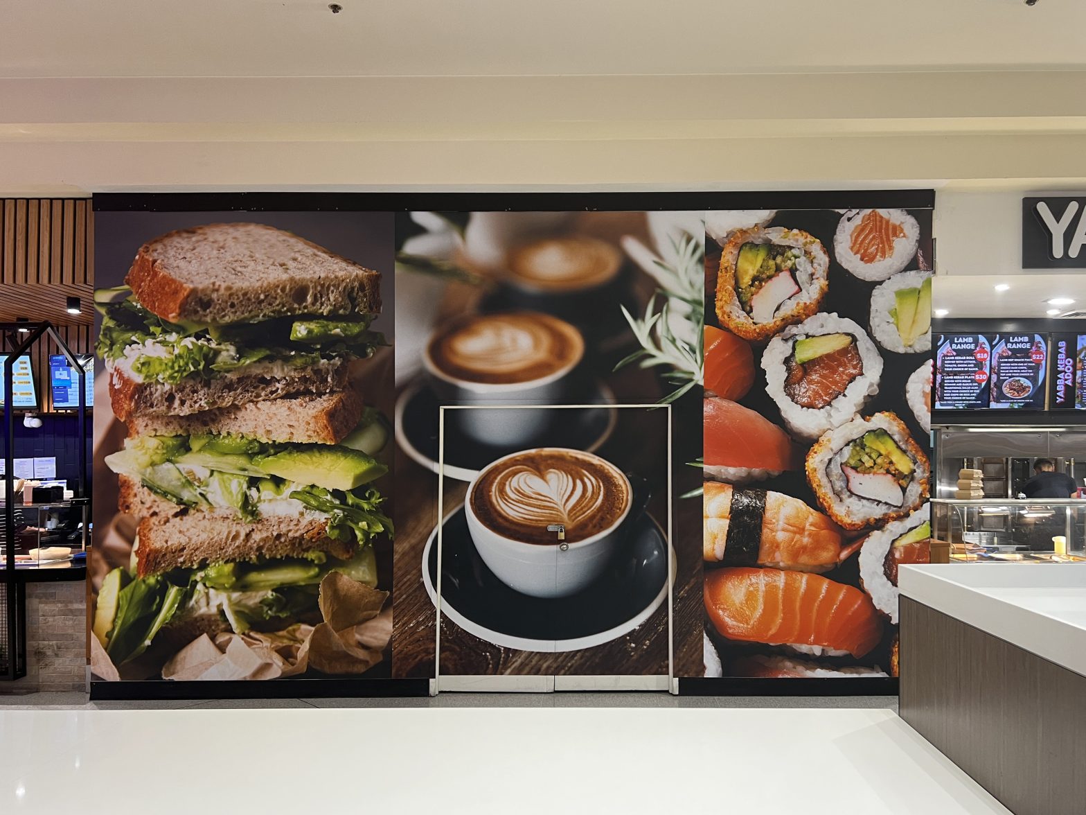
Signage Design Mistakes To Avoid

Imagine putting time and money into a sign only for people to walk past your building without noticing it. Even worse, they read it and decide to go to the next store.
Poorly designed signage can have little impact or leave a lasting negative impression, affecting your business and reputation. To help you prevent this, we’ve compiled common design mistakes to avoid when creating your sign and ways to make your signage stand out.
What Makes Bad Signage?
Poor design is often the reason for ineffective signage. Elements like text, colour scheme, and graphics are the focal points in signs, and when poorly planned and designed, they can impact the quality of your signage.
6 Design Mistakes To Avoid When Creating Your Signage
Common design mistakes to avoid include cluttered layouts, hard-to-read text, confusing messaging, distracting colours, and low-quality graphics.
1. Over Cluttered Backdrop
One of the biggest design mistakes is over-cluttering your background. Too much text, artwork, and colour can overwhelm audiences and distract from your messaging.
2. Confusing Layout
Signs should highlight and direct audiences to the action you want them to take. When your text or messaging is unorganised, important information can get lost. Audiences may also be confused about what to focus on and miss key points.
3. Illegible Text
Another design mistake is illegible or hard-to-read text, which is typically caused by choosing the wrong text size and font and uneven spacing.
- Size: Text that is too small can be less visible and problematic to read, while text that is too big can be overpowering and less visually appealing.
- Poor font choice: Some fonts may be less visible on signage than others, and using the wrong font can impact the look and readability of your sign.
- Spacing: Uneven spacing between letters and words can make your design look muddled and sign hard to read.
- Text colour: Text that is too light or the same as the backdrop can get lost in your design.
4. Poor Colour Choices
Your colour scheme can make or break your signage. Too bright colours may overwhelm your design, while lighter hues can be difficult to see from afar. Too many colour combinations can also be distracting.
5. Low Graphic Quality
Your artwork is often what draws people to your signage. Low-resolution images and poorly designed graphics can impact your design aesthetic and make your signage and brand look unprofessional.
6. Improper Material
Printing on low-quality materials or substrates can impact the look and durability of your signage. For example, if you create exterior signage and use a material not made for outdoor use, your sign may wear and break in rain or wind.
What Is Crucial in Good Signage?
Good signage requires clear and concise messaging, visible text, and contrasting and visually appealing colours. Combining these elements creates an impactful sign that is easy to read and understand.
How To Make Your Signage Stand Out?
The best way to make your signage stand out is to combine design best practices, such as using bold colour, clear text, concise messaging, and high-quality images.
- Bold colours: Use colours that draw attention and contrast them with lighter hues to create variation and design symmetry.
- Clear typography: Choose fonts that are easy to read and have optimal text sizes.
- Simple messaging: Consider a less-is-more approach and use a clear and concise call to action (CTA) when creating your message.
- High-resolution images: Choose relevant, high-quality images or artwork to make your sign look more professional and attractive.
- Brand consistency: Keep your design consistent with your brand to make it easily recognisable.
- Strategic placement: Install your sign where everyone can see it and ensure your messaging is at eye level.
Work With the Experts at Splash Colour Imaging
Now that you know the do’s and don’ts of signage design, it’s time to create your sign. If you need professional expertise, we can help.
Splash Colour Imaging is a leading Sydney display and exhibition signage provider specialising in wide-format print signs. Our team is skilled and experienced in signage design, printing, and installation. They use the latest techniques and trends to create attractive and compelling displays.
Contact us today to learn more about our services and get started.